
Soooo.....UX: Let's Start With a Case Study
Unpacking the Key Lessons Learned in Redesigning The New York Times App Case Study.


Okay! So my last article UI/UX - So, it all begins... saw me introducing my short knowledge of UI/UX. This week I delved into User Experience and the process, and here is me unpacking what stood out for me in the process of examining a UX case study, specifically the Redesigning The New York Times App Case Study.
Follow me...
The New York Times app provides valuable insights into user-centered design thinking. And, throughout the redesign process, the designers leveraged research, iteration based on feedback, and a focus on integration into users' lifestyles.
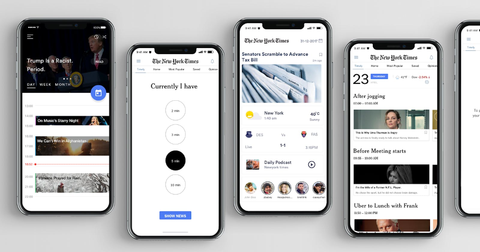
The designers Goal and Proposal highlight that Instead of overhauling the existing NYT app, they will add a subtle and useful feature to that landing page called "Timely."
"Timely" will enable the user to receive notifications at opportune moments throughout a busy day: at breakfast, on a commute, before a meeting, during a coffee break, or right before bed.
These notifications will assist the user in opening Timely and accessing articles. It will take only a short time to read. Most importantly, the articles are catered to each user based on their interests and habits.
In redesigning the app, Johny Vino, and his team followed a unique design process, and three of those stood out for me.
User Research: The Bedrock
A cornerstone of design thinking is developing empathy for end-users through research. The design team conducted interviews and sent surveys to understand target users' pain points and needs. One interviewee said, "I'm interested. I think it's time. I don’t have a designated time besides the morning email I get where I just look at the news” This revealed opportunities to better integrate news reading into users' daily habits.
Interviewing helped uncover user habits around news consumption. One stated, "I spent all my time in reading the crappy news”, demonstrating dissatisfaction with current news apps. Surveys also provided data on the usage of other platforms like social media and radio for news. These insights informed later design decisions around providing more relevant, satisfactory content.
The team synthesized findings into an empathy map, including what users think, feel, see, hear, say, and do. For example, the map showed users feel "overloaded” and hear things like “Did you see the news today?”. This structured approach ensured the design process centered on actual users.
Iteration & Prototyping: In the Designers Head
The design team did not follow a linear path but rather iterated based on feedback on initial concepts. After brainstorming 15 ideas, the team sought input from stakeholders, like The New York Times VP of Design who critiqued a calendar layout. This led the designers to pivot to a portrait orientation better for displaying news articles.
The group also created storyboards to envision user scenarios and developed wireframes of the UI. In fact, they produced multiple rounds of wireframes, enabling iteration of the layouts and flows. They conducted usability tests on prototypes to gather further feedback to refine the design. This exemplifies iterating based on feedback and testing, rather than rigidly sticking to initial concepts.
Seamless Integration: Sync with the User
In focusing on Seamless Integration into User Habits, a guiding design principle was integrating the app redesign into users' existing habits and schedules. This influenced the development of features like a manual mode where users select how much time they have available to read news. As one user said, “I have many little free time slots”, so this accommodates small windows of availability.
The team also designed an automatic mode syncing with Google Calendar, pulling in users' meeting times, travel, and other events. As the case study notes, this “understands the user lives in a better way”. Leveraging existing tools demonstrates a focus on seamlessly fitting the redesign within users' lifestyles.
Soooo, here you have it, this case study provides a detailed look at effective UX design thinking. From extensive user research to iterating through prototypes to seamless integration with user contexts, it demonstrates human-centered processes. Key takeaways include the value of interviewing and surveying users, soliciting ongoing feedback, and designing the path of least resistance by meeting users where they are. This case study highlights best practices that UX designers can apply to create intuitive, user-friendly experiences.